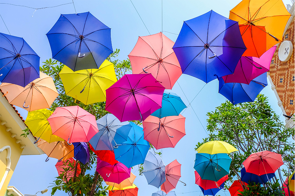
January gets all the attention for being the start of a new year. However, a bit past the halfway mark is the real litmus test on how 2017 is really doing in terms of design. Color has exploded this year and one only has to take a look at the latest trends to see how. Below is a quick rundown of which colors are now making up the spectrum of style.
Turn your back on black
The black and white color scheme is beloved in Europe. In America, black matte was all the rage in 2016. Kitchen appliances and home interiors had to be in the midnight hue to be considered chic. One effect of this trend was that rooms painted black appeared to be more compact than they were. This year had the official ‘let’s just be friends’ chat with this monochromatic palette and started a long-term affair with the exploration of other color.
Green with style
After a few controversial choices, Pantone nailed 2017’s Color of the Year. Greenery is inspired by nature and playfully retro. This lush shade welcomes a tropical breeze into every room. It may not be a coincidence that palm tree and leaf motifs have blown up in popularity. Explore shades from bright lime to rich forest greens. Be subtle and use this hue in accents, such as glasses or mugs in the kitchen. Go bolder with living room rugs or with an accent wall in the entryway.
Camel is a tall drink
This warm brown tone is one of the latest neutrals. Many designers use this rustic hue to add a quiet richness to any room. Its power comes from its timeless adaptability. A great color combination is to soothe a strong color like red or indigo with camel, adding in a gold accent to bring depth. Leather and varying wood stains are popular ways to boost the refined neutral in a room. Try the hue in dressing areas to provide a great backdrop. Chic camel outdoor cushions play off wood elements.
The Bronze Age returns
Metallics have been having a moment for a while. They go well with lighter or darker hues in any décor. Brass, inspired by the resurgence of 1980s décor, has given way to stunning rose gold that has in turn been taken over by bronze. This warming metal is classic and works well with almost any decorating style as it plays a bit more on the neutral side. Try the metallic out with decorative bowls in the kitchen or outdoor dining spaces. Vases and lamps are great accent options.
Clashing is smashing
Color clashing must be done only as you see fit. However, the rule seems to be the bolder and brighter the better – always. It does not end with colors; opposing textures and patterns can be fun to play with as well. Faux fur throws and jute rugs add rich texture to any room. Likewise, softer pastels work stunningly with the latest batch of geometrics as a balance between masculine and feminine.
Don’t blush at the latest “it” neutral
Millennial pink was the social media darling of last year for good reason. By design, neutrals must flow with other colors in a space without taking away too much attention. While pink may not be traditionally thought of as a neutral, blushing tones work well as the new “it” neutral. Blushes are so hot right now as their warm undertones complement traditional neutrals of grays, browns and creams. Add softness to a room with a blush side chair or be unexpected by using this hue for light fixtures.
Forget black and bland neutrals – let this year be the year your home gets an infusion of color.


